
Marketing Visualization Turning Data Into Compelling Stories
Have you ever tried to understand a complex story by only reading a dictionary? That’s what it feels like for your audience when you throw raw data at them. Marketing visualization is the art of turning that dictionary into a captivating movie—transforming dense reports and abstract ideas into visuals that click instantly and resonate emotionally.
What Is Marketing Visualization and Why It Matters Now

In a world overflowing with information, your message can’t just show up; it has to connect. Marketing visualization is the strategic use of visual formats to communicate marketing messages, break down data, and tell compelling brand stories. Considering the human brain processes images 60,000 times faster than plain text, visuals are no longer a nice-to-have. They’re an essential tool for cutting through the digital noise.
This goes far beyond creating pretty charts or flashy animations. It’s about translating complexity into clarity. Whether you’re explaining an intricate software product or showcasing quarterly performance, visuals make the information easier to digest, remember, and share.
The Core Goal: Making Your Message Felt
The real purpose of marketing visualization is to make your message felt, not just seen. An emotional connection is what builds brand loyalty and drives action, something a list of features or a dense spreadsheet can never achieve on its own.
This is done by:
- Simplifying Complexity: We break down tough topics into visual narratives that anyone can understand. This is especially crucial in fields where you need to explain technical details clearly, a process we dive into with technical visualization.
- Increasing Engagement: Dynamic visuals like motion graphics and videos hold attention far longer than static text, keeping your audience locked into your story.
- Boosting Retention: People are much more likely to remember what they see than what they read. A well-designed infographic or explainer video can stick in a customer’s mind for weeks.
To give you a clearer picture, here’s a quick breakdown of how these visual strategies directly support your marketing efforts.
Core Benefits of Marketing Visualization
| Benefit | Impact on Marketing Goals |
|---|---|
| Enhanced Comprehension | Your audience immediately grasps complex ideas, reducing confusion and shortening the sales cycle. |
| Increased Engagement | Visuals capture and hold attention, leading to lower bounce rates and higher interaction on social media. |
| Improved Memorability | A strong visual identity ensures your brand message sticks, improving brand recall and recognition. |
| Stronger Emotional Connection | Storytelling through visuals builds trust and loyalty, turning passive viewers into active brand advocates. |
This table shows it’s not just about looking good; it’s about communicating more effectively to achieve tangible business results.
Ultimately, marketing visualization is the bridge between your data and your audience’s understanding. It ensures your key insights aren’t lost in a sea of numbers but are instead transformed into a compelling narrative that inspires and persuades.
By putting visual communication first, you shift from simply presenting information to creating a memorable experience. This approach is no longer a luxury—it’s a necessity for any brand that wants to capture attention and hit its marketing goals.
The Four Pillars of Modern Marketing Visualization
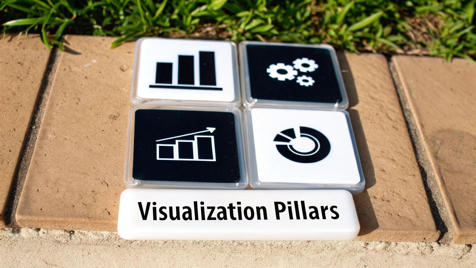
To really turn abstract ideas into visuals that grab attention, you need more than one trick up your sleeve. Marketing visualization isn’t a single method; it’s a toolkit of different disciplines, each designed for a specific job.
Getting to know these four pillars is the key. It helps you pick the right approach to make sure your message doesn’t just get seen, but truly connects with your audience. Think of them as the foundation for any visual strategy that actually works.
Data Visualization and Infographics
At its core, data visualisation is about turning dull spreadsheets and dense reports into charts and graphs that make immediate sense. It’s like having a translator that can speak the language of numbers but explains it all in a picture everyone can understand. It answers critical questions—”How are our sales trending?” or “Which ad campaign is bringing in the best leads?”—by showing you the answer, not just telling you.
Infographics take things a step further. A single chart might give you one piece of the puzzle, but an infographic arranges multiple charts, icons, and a bit of text into a complete story. It’s the difference between seeing one great scene and watching the entire movie trailer.
A well-designed infographic doesn’t just present facts; it guides the viewer on a journey through a topic, making complicated information feel simple and easy to share.
Motion Graphics and Brand Animations
This is where static designs get a jolt of energy. Motion graphics make your logos, text, and brand shapes move, creating a dynamic identity that sticks in people’s minds. That slick animated logo you see at the start of a company video? Or the smooth transitions in a presentation that keep you hooked? That’s the magic of motion graphics.
This type of marketing visualization is a powerhouse for a few key reasons:
- Grabbing Attention: Our eyes are naturally drawn to movement. Animation makes it almost impossible for viewers to look away from your message.
- Building Brand Recall: When your logo or colour scheme animates in a consistent way, it builds a strong, modern, and memorable brand personality.
- Emphasising Key Points: You can use animation to subtly guide the viewer’s eye to the most critical information, making sure nothing important gets missed.
Product and Technical Animation
How do you explain a product that works on a microscopic level? Or a process that’s completely invisible? That’s where product and technical animation comes in. Using detailed 2D or 3D models, we can peel back the layers and deconstruct complex subjects, showing exactly how they work from the inside out.
For anyone in medicine, engineering, or software, this is an absolute game-changer. It allows you to showcase the inner workings of your technology, highlight the features that set you apart, and build real trust with customers by making the complicated feel straightforward. That kind of clarity can be the deciding factor when you’re trying to win over an investor or help a customer truly grasp the value you’re offering.
Explainer Videos
Explainer videos are where all the other pillars come together. They mix storytelling, motion graphics, and even data visuals into a short, powerful package. Usually lasting just 60 to 90 seconds, their one job is to answer three questions fast: What’s the problem? How do you solve it? And what should I do next?
By wrapping a clear, concise script in compelling animation, explainers cut through the noise and make your core value proposition unforgettable. They’re incredibly versatile, working perfectly on landing pages, in social media ads, and during sales pitches to ensure your message lands perfectly, every single time.
How Different Industries Leverage Visual Storytelling
It’s one thing to talk about theory, but seeing marketing visualization out in the wild really shows you what it can do. The same core ideas of visual storytelling get tweaked and adapted to solve completely different problems across various sectors.
Whether it’s a fast-moving agency or a highly specialised medical firm, the end goal is always the same: land your message with clarity and impact. The way they each get there, though, really shows off the flexibility of visual content.
Advertising and PR Agencies
For ad and PR agencies, the biggest fight is just getting noticed. The media world is incredibly crowded, and they need to cut through all that noise. High-impact animations and slick motion graphics are their secret weapons for creating campaigns that actually make people stop scrolling.
Instead of just posting another static image, they use dynamic brand animations to inject personality into a company’s social media feed. A perfectly timed motion graphic can turn a simple product reveal into a major event, creating a level of buzz and engagement that a flat picture just can’t touch.
Corporate Marketing Teams
Inside a large corporation, marketing teams have to play a double game. They need to hook external customers while also getting everyone internally on the same page. That’s why polished product launch videos are so vital—they build excitement in the market and make the new product’s value crystal clear.
But they also use animation internally. Complex new strategies or company-wide achievements can be distilled into short, animated videos that keep every employee in the loop and fired up. These visuals help build a single, strong brand story that works just as well inside the company as it does outside.
When quarterly reports become engaging data visualisations, or company-wide memos are turned into quick animated stories, you can be sure that critical information isn’t just sent out—it’s actually understood and remembered.
Tech and Medical Companies
In the tech and medical fields, you can’t afford to be misunderstood. Products are often incredibly complex, and explaining them is a real challenge. This is where precise technical animations become absolutely essential. A detailed 3D animation can take you inside a sophisticated surgical device or map out the architecture of a new software platform.
These visuals are non-negotiable for educating investors, getting sales teams up to speed, and building trust with customers. For instance, in super-specialised areas like forensic visualization, creating a clear and accurate animation is a core part of the job. It makes abstract, technical concepts feel tangible and easy to grasp.
Startups and Scale-Ups
For a startup, the whole game is about getting a big idea across—fast. They need to grab the attention of investors and win over their first customers, and a powerful explainer video is often their best tool for the job.
In just 60-90 seconds, a sharp animated explainer can lay out a common problem, introduce the startup’s brilliant solution, and tell people exactly what to do next. It’s a short, punchy format that’s perfect for landing pages, investor pitch decks, and social media campaigns. It helps new companies make a great first impression and start building momentum right from day one.
Best Practices for Effective Marketing Visualization
Creating stunning visuals is one thing, but making sure they actually deliver results is another game entirely. It’s the difference between just making noise and truly making an impact. Following a few battle-tested best practices can ensure your creative efforts translate directly into strategic success, turning curious viewers into believers, and prospects into loyal customers.
It all starts with a non-negotiable first step: truly understanding your audience. Before a single pixel is placed on the screen, you have to know who you’re talking to. What keeps them up at night? What are their biggest pain points? The visual language and animation style that captivates a startup founder probably won’t land the same way with a corporate executive.
Focus on a Single Powerful Message
Once you know your audience, it’s time to sharpen your message. The most effective visuals hammer home one core idea with absolute clarity. Trying to cram every feature and benefit into a single infographic or video is a surefire way to overwhelm people and lose their attention completely.
Every successful marketing visualization has a singular purpose. It should answer one key question or solve one specific problem for the viewer. Resist the temptation to cover everything; instead, focus on delivering a single, powerful takeaway that sticks.
This principle of focus is what makes your message not just seen, but actually understood and remembered long after the screen goes dark.
Maintain Strict Brand Consistency
Think of your visuals as an extension of your brand’s personality. Keeping your colours, fonts, and overall tone consistent across every single visual asset is critical for building trust and recognition. When your audience sees a video or a graphic, they should instantly connect it with your brand—even without seeing the logo.
This consistency creates a seamless, professional experience. For a closer look at how this works in practice, you can see the value a professional animated brand video brings to solidifying a brand’s identity. It’s this kind of reliability that helps turn a one-time viewer into a dedicated follower.
Finally, always remember to prioritise storytelling over just dumping data. Your visuals should take your audience on a clear and compelling journey, with a distinct beginning, middle, and end. This narrative structure is what makes your content far more engaging and persuasive. And to make sure your visual content always looks polished and professional across every channel, it’s a good idea to consult a guide on the required social media post dimensions for various platforms.
Measuring the Impact of Your Visual Content
Creating a stunning visual is just the start. The real test is proving it’s actually moving the needle for your business. To do that, you need to look past surface-level stats like views and likes and dive into the Key Performance Indicators (KPIs) that connect your marketing visualization efforts directly to business goals.
Different visuals have different jobs, so you can’t measure them all the same way. Think about an explainer video on your landing page. Its primary goal is probably to get people to act. So, you’d want to track metrics like the conversion rate (how many viewers actually sign up or buy) and time-on-page. If both of those numbers jump up after you add the video, you’ve got a strong signal that it’s doing its job.
This infographic breaks down the essential elements that go into creating visual marketing that truly connects, ensuring every piece speaks to the right audience and reinforces your brand.
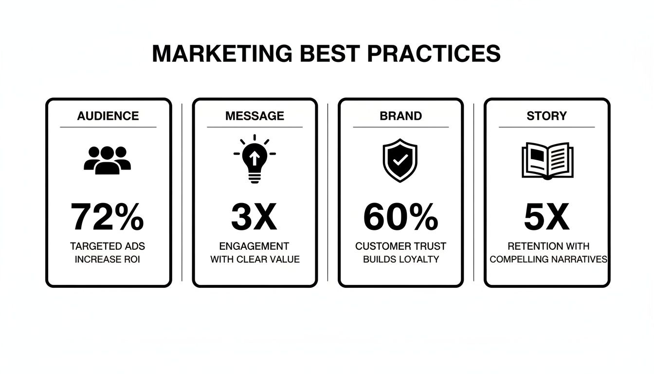
At the end of the day, everything—from who you’re talking to, to the story you’re telling—has to pull together to deliver results you can actually measure.
Aligning Metrics with Visual Types
Now, let’s switch gears to animated social media ads. Here, the game is all about instant reaction. The most telling KPIs are your click-through rates (CTR) and engagement rate (all those likes, comments, and shares). These numbers tell you if your visual was powerful enough to stop someone mid-scroll and get them to interact—a crucial first step.
The Polish online advertising market gives us a real-world look at why this matters. In October 2025, the market tracked a massive 88.2 billion digital ad impressions. Video ads hit a 61.6% viewability rate, completely overshadowing the 48.8% for static display ads. This isn’t just a random stat; it shows that dynamic content gets seen more, plain and simple. It’s hard data that shows how specialists like Simple Frame, who live and breathe 2D/3D animation, can give a real boost to campaigns, especially in buzzing sectors like retail and e-commerce. You can dig deeper into these numbers on the Polish advertising market from Gemius.
By choosing the right KPIs for each type of marketing visualization, you can build a robust measurement framework. This framework moves your visual content from a creative expense to a proven, revenue-driving investment.
To make this super practical, here’s a breakdown of which metrics really matter for different types of visuals.
Here’s a comparative look at the most relevant metrics for measuring the success of different visual marketing assets.
Key Performance Indicators by Visualization Type
| Visualization Type | Primary KPI | Secondary KPI |
|---|---|---|
| Explainer Video (Website) | Conversion Rate | Average Time on Page |
| Animated Ad (Social Media) | Click-Through Rate (CTR) | Engagement Rate |
| Infographic (Blog Post) | Social Shares & Backlinks | Scroll Depth |
| Technical Animation (Sales) | Lead Generation Rate | Demo Request Rate |
By keeping a close eye on these specific indicators, you’ll be able to confidently show the return on investment (ROI) from your visual marketing. More importantly, you can use that data to fine-tune your strategy for even better results next time.
Bringing Your Vision to Life with an Expert Partner
Knowing you need powerful visuals is one thing, but actually creating them is a whole different ball game. This is where a dedicated partner can step in and turn your marketing visualization strategy from a great idea into a tangible asset that gets results. An expert studio handles the entire creative journey, taking your vision from a rough concept and storyboard sketches all the way to final animation, post-production, and sound design.
This end-to-end management is what separates mediocre content from polished, effective visuals. When you partner with specialists in 2D/3D animation and technical visualization, you’re essentially giving your brand a team that knows how to navigate the complex world of production. This collaboration makes sure the final product doesn’t just look stunning but also aligns perfectly with what you’re trying to achieve as a business.
The Value of a Creative Ally
Finding the right creative ally means you have a team that is genuinely dedicated to translating your goals into a visual language that your audience will connect with. They bring both the technical skill and the strategic thinking to the table, ensuring every single frame has a purpose. In today’s crowded digital space, having that level of quality is absolutely essential for cutting through the noise.
The demand for this kind of expertise is clear. Poland’s advertising industry, for example, is booming and was projected to hit a market size of €9.8 billion in 2025. This growth just goes to show how much businesses are relying on specialised creative services to produce visual content that makes a real impact. You can explore more data on Poland’s thriving advertising agency market from IBISWorld.
An expert partner doesn’t just follow a brief; they elevate it. They bring fresh perspectives and deep industry knowledge to help you create visuals that are not only beautiful but also strategically sound and built to perform.
Ultimately, this kind of partnership frees up your internal team to focus on what they do best—running your business—while the visual production is handled by seasoned pros. And as technology evolves, leveraging tools like the best text-to-video AI tools is also becoming a key part of turning data and ideas into compelling content.
Working with an experienced explainer video agency is a perfect example of this in action. They provide the structure and creativity needed to boil down a complex message into a short, engaging, and memorable story. It’s how you ensure your investment in marketing visualization delivers a powerful return.
Frequently Asked Questions About Marketing Visualisation
As you dive into the world of marketing visualisation, a few questions are bound to pop up. It’s only natural to want a clear picture before deciding which path is right for your goals. We’ve gathered some of the most common queries to give you that extra bit of clarity.
Think of these as the quick-fire round, reinforcing some of the core ideas we’ve discussed and tackling the practical points you might be weighing up.
What’s the Difference Between Data Visualisation and an Infographic?
This is a great question, and the answer is all about scope. Think of a data visualisation as a single, powerful snapshot—a crisp bar chart showing your quarterly sales growth, for example. It’s the raw, graphical representation of data designed to reveal one specific insight or pattern.
An infographic, on the other hand, tells the whole story. It’s a carefully curated narrative that weaves together multiple data visualisations, text, icons, and other design elements to explain a much broader concept. To put it another way: the chart is one critical scene, while the infographic is the entire film.
How Long Does It Take to Produce a Marketing Animation?
The timeline really hinges on the complexity, style, and length of the animation you have in mind. A straightforward 30-second 2D motion graphic, for instance, might take about one to two weeks from the initial idea to the final file.
A highly detailed, 90-second 3D technical animation, however, is a much bigger undertaking. That could require six to eight weeks, or even more. The process moves through several distinct stages—scripting, storyboarding, design, animation, and sound—and each one needs close collaboration and feedback to get the polished result you’re after.
Can Marketing Visualisation Actually Improve SEO?
Yes, it absolutely can. The benefit isn’t direct—it’s not like Google “sees” the animation—but it’s incredibly powerful. High-quality visuals like explainer videos and interactive infographics are fantastic at keeping visitors on your website for longer. This increased “dwell time” is a strong signal to search engines that your content is valuable and engaging, which can give your search rankings a healthy boost.
Beyond that, truly compelling visuals get shared. People post them on social media, and other websites link back to them as a resource. This process helps you earn valuable backlinks from authoritative sites, which is a cornerstone of building strong, long-term SEO performance.
Ready to turn your complex ideas into clear, unforgettable visuals? The team at Simple Frame specialises in creating high-quality animations and videos that make your message stick. Visit us at simpleframe.com to see how we can bring your vision to life.